Project Type
Published Book
Industry
Higher Education
UMBC Review


Bridging 10 Academic Fields Through Design
The University of Maryland, Baltimore County releases a student led research journal every year called the UMBC Review. I had the privilege of designing the 25th volume, which featured 10 papers, ranging from sociology to quantum physics. The challenge was to create an overarching concept that bridges each author’s unique position, while also celebrating the diversity of knowledge.
The University of Maryland, Baltimore County releases a student led research journal every year called the UMBC Review. I had the privilege of designing the 25th volume, which featured 10 papers, ranging from sociology to quantum physics. The challenge was to create an overarching concept that bridges each author’s unique position, while also celebrating the diversity of knowledge.
A Metaphor in Bloom
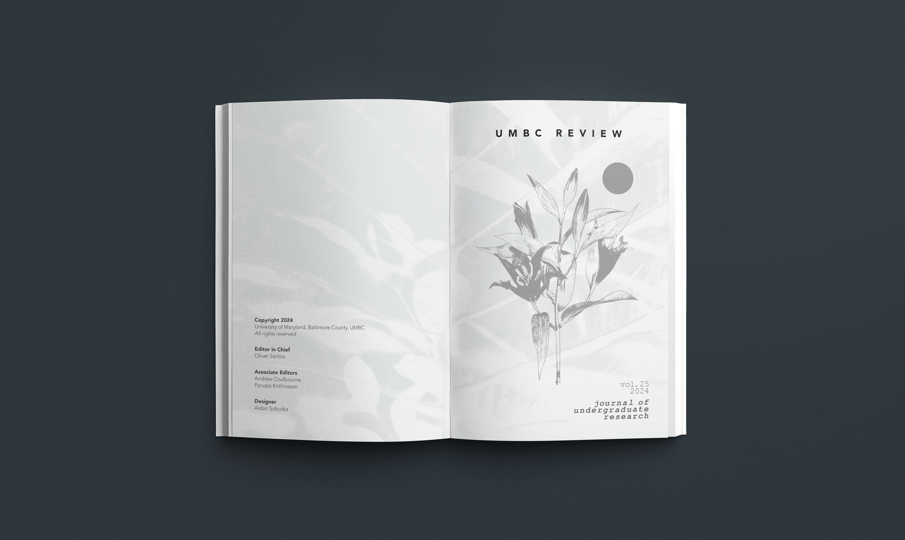
I chose an organic, minimalistic visual language to evoke the essence of academic exploration. The cover needed to resonate with both seasoned researchers and curious undergraduates. By embracing simplicity, I aimed to convey the idea that knowledge, like nature, unfolds through gradual processes. The lily flower became our central motif. Its delicate petals symbolized growth, discovery, and the unfolding of ideas. The stylistic choice of the lily plays into the theme of processes, relating back to research. The lily flower, shown as a negative, ties into the film development process, relating to notions of steps, just as in a research journey.
I chose an organic, minimalistic visual language to evoke the essence of academic exploration. The cover needed to resonate with both seasoned researchers and curious undergraduates. By embracing simplicity, I aimed to convey the idea that knowledge, like nature, unfolds through gradual processes. The lily flower became our central motif. Its delicate petals symbolized growth, discovery, and the unfolding of ideas. The stylistic choice of the lily plays into the theme of processes, relating back to research. The lily flower, shown as a negative, ties into the film development process, relating to notions of steps, just as in a research journey.


In the Hands of the Reader
To ensure reader comfort, I conducted user testing with my roommates. I presented them with different interior designs, each featuring varying font and margin settings. I asked them to simply read a page from each version. Then I asked them which felt the most comfortable. The deciding factor funneled down to the margins. The participants mentioned the importance of thumb placement. They wanted ample space for their thumbs to rest without obscuring the text. Based on the user feedback, I decided on a 2:1 ratio for the margins of the text body. This deliberate asymmetry allowed readers to comfortably hold the book near the bottom, while also preventing text distortion near the spine.
To ensure reader comfort, I conducted user testing with my roommates. I presented them with different interior designs, each featuring varying font and margin settings. I asked them to simply read a page from each version. Then I asked them which felt the most comfortable. The deciding factor funneled down to the margins. The participants mentioned the importance of thumb placement. They wanted ample space for their thumbs to rest without obscuring the text. Based on the user feedback, I decided on a 2:1 ratio for the margins of the text body. This deliberate asymmetry allowed readers to comfortably hold the book near the bottom, while also preventing text distortion near the spine.


Getting the Word Out
To promote the release, I created a series of countdown posts and motion graphics for UMBC’s social media channels. Each piece was adapted for different formats, from the university website to Instagram stories, helping the publication reach both students and faculty across campus. The final printed edition represented months of collaboration between editors, faculty, and designers. Every element, from typography to photography, worked toward making academic research feel approachable and visually engaging. Seeing stacks of the book around campus and hearing from students who contributed to it was incredibly rewarding. The project reminded me how thoughtful design can make complex ideas feel accessible without losing their integrity.
To promote the release, I created a series of countdown posts and motion graphics for UMBC’s social media channels. Each piece was adapted for different formats, from the university website to Instagram stories, helping the publication reach both students and faculty across campus. The final printed edition represented months of collaboration between editors, faculty, and designers. Every element, from typography to photography, worked toward making academic research feel approachable and visually engaging. Seeing stacks of the book around campus and hearing from students who contributed to it was incredibly rewarding. The project reminded me how thoughtful design can make complex ideas feel accessible without losing their integrity.
