Project Type
UI / UX Design Concept
Industry
Technology
MorsePal

Making Morse Code Approachable
MorsePal is a mobile app concept designed to encode and decode Morse code quickly and intuitively. The goal was to remove friction from a system that often feels outdated or hard to approach, especially for people interested in tech, amateur radio, or signal-based communication. The app focuses on speed and clarity, allowing users to translate Morse code using touch input, audio, or text without needing prior experience.
MorsePal is a mobile app concept designed to encode and decode Morse code quickly and intuitively. The goal was to remove friction from a system that often feels outdated or hard to approach, especially for people interested in tech, amateur radio, or signal-based communication. The app focuses on speed and clarity, allowing users to translate Morse code using touch input, audio, or text without needing prior experience.
Designing for the User
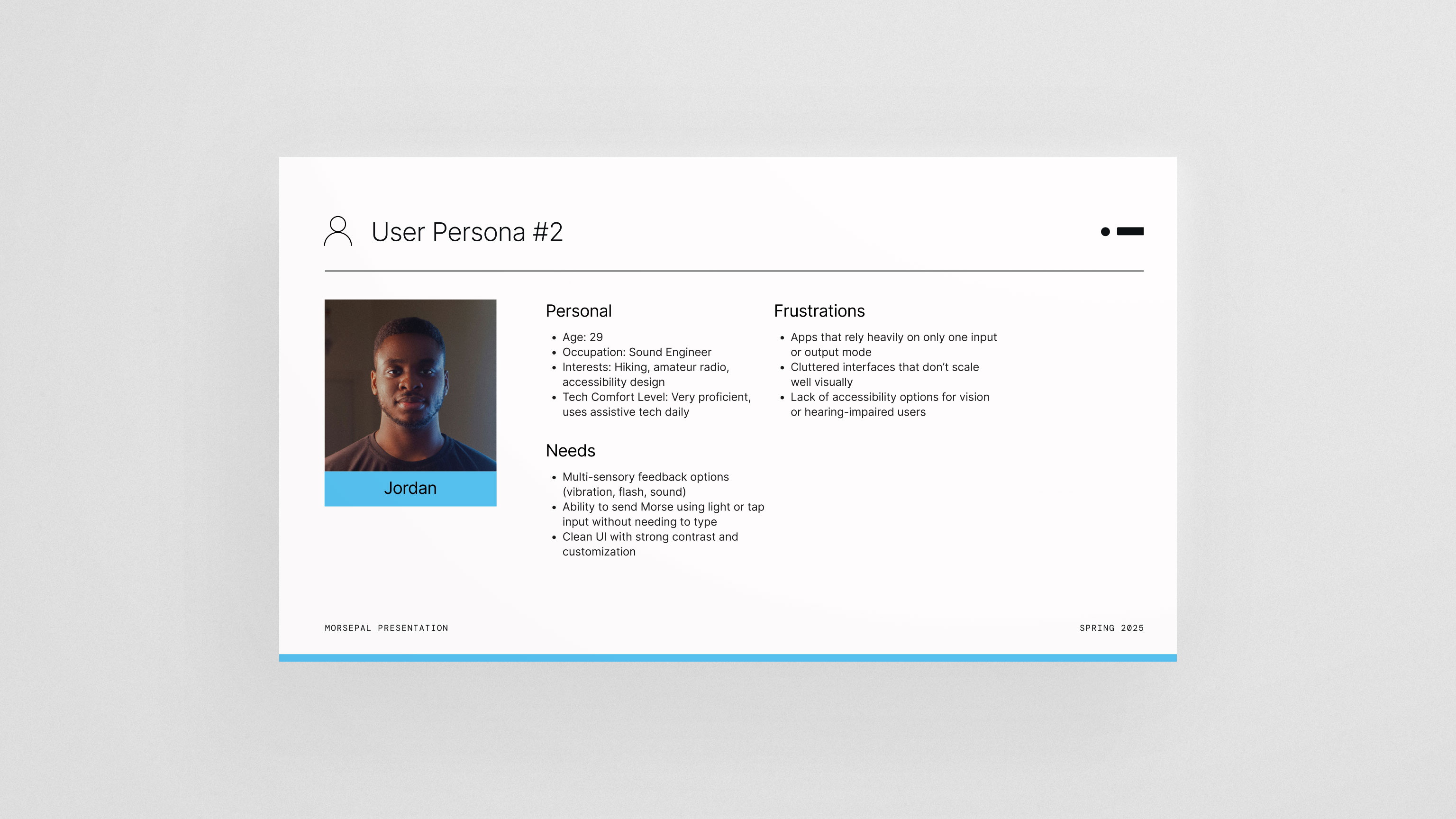
I created a user persona centered around tech-curious users and amateur radio enthusiasts who value efficiency and control. The app needed to feel precise without being intimidating. Every decision focused on reducing cognitive load, keeping the interface simple, and making the primary actions obvious. The purpose wasn’t to teach Morse code from scratch, but to give users a reliable, modern tool they could pick up and use immediately.
I created a user persona centered around tech-curious users and amateur radio enthusiasts who value efficiency and control. The app needed to feel precise without being intimidating. Every decision focused on reducing cognitive load, keeping the interface simple, and making the primary actions obvious. The purpose wasn’t to teach Morse code from scratch, but to give users a reliable, modern tool they could pick up and use immediately.
Testing, Flow, and Visual Direction
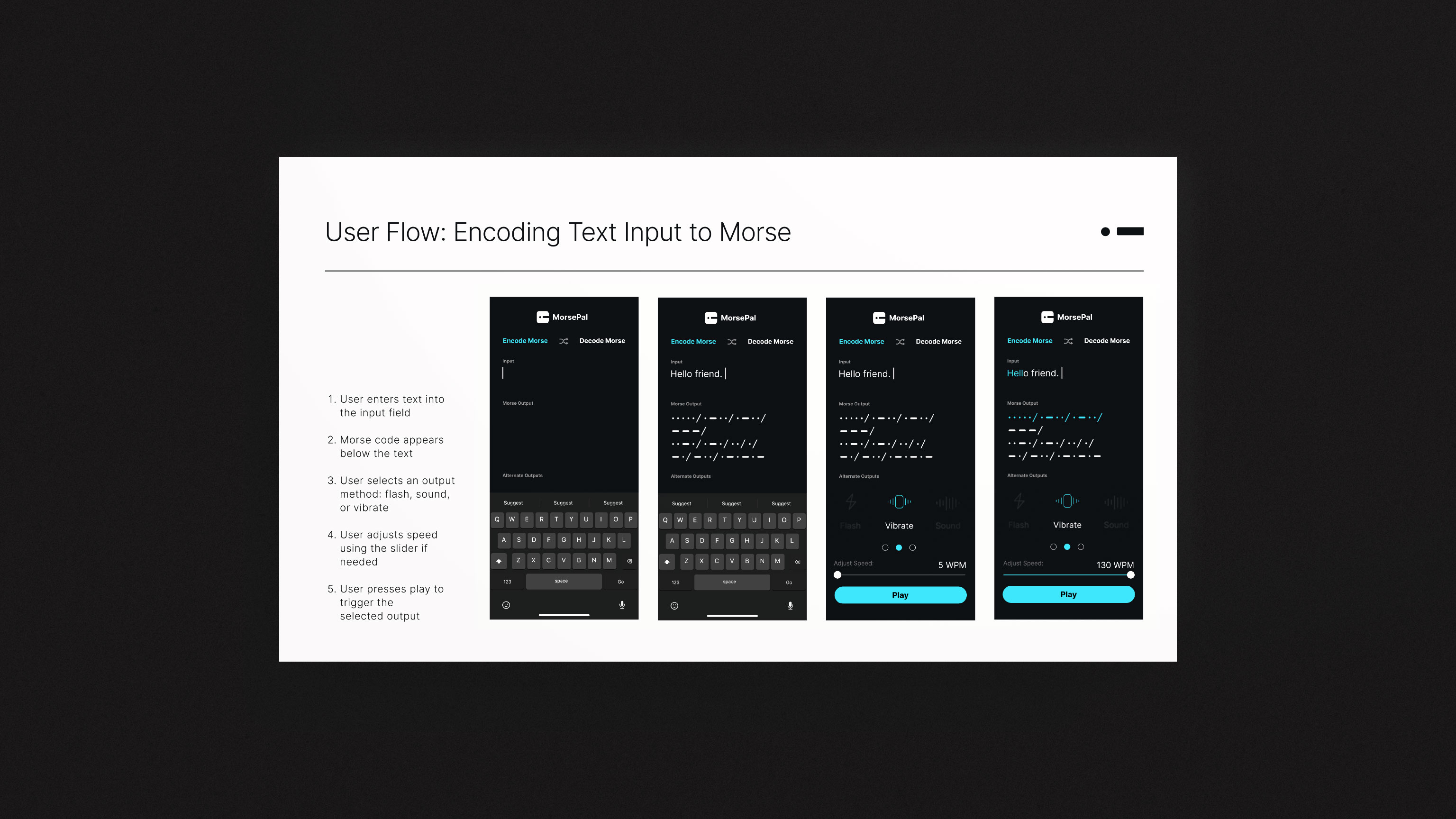
I tested the user flow with three participants through UserTesting.com to evaluate clarity, ease of use, and overall navigation. The feedback highlighted small but important pain points, which led to refinements such as adding adjustable playback speed so users could control how Morse code is heard or played back. Once the flow was refined, I focused on the visual system. The dark interface, high-contrast cyan accents, and minimal iconography reinforce a technical, focused feel while keeping the app readable and accessible. The branding and UI were designed to feel modern, calm, and intentional
I tested the user flow with three participants through UserTesting.com to evaluate clarity, ease of use, and overall navigation. The feedback highlighted small but important pain points, which led to refinements such as adding adjustable playback speed so users could control how Morse code is heard or played back. Once the flow was refined, I focused on the visual system. The dark interface, high-contrast cyan accents, and minimal iconography reinforce a technical, focused feel while keeping the app readable and accessible. The branding and UI were designed to feel modern, calm, and intentional


